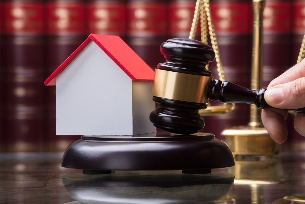
Experts share an exclusive sneak peak at the 2017 colour trends.
By CAITLYN NG LI YUIN and NURUL ASMUI MD AZMI
WE see colours in every nook and cranny of the world. They have become a major part of our lives and we cannot deny that colours play a significant role in our lives and our societies. Just think about the fast food chains across the country. When we see yellow, we think of McDonald’s, red represents Kentucky Fried Chicken (KFC), orange relates to A&W and so on.
According to the Chester F. Carlson Centre for Imaging Science at the Rochester Institute of Technology, there is nearly an infinite number of colours. A splash of colour can help improve our moods, our wellbeing as well as our homes. Thus, we see mixed colours on all sorts of materials including paints, fabrics, pens and decoration pieces.
Colours are no longer just a slap of paints on a canvas or one tone colour on house walls, it has become an integral part of our lives. Some of us might recall that last year Pantone have chosen the blending of two shades – Rose Quartz and Serenity as the colour of the year 2016.
The name Pantone is known worldwide as the standard language for colour communication from designer to manufacturer to retailer to customer. People have looked to Pantone not only for the interior designing of their homes, but for wedding decor, fashion as well as appliances.
Several experts share their predictions for the colours of 2017.
[slider id='81590' name='StarProperty' size='full']
Unity in colour diversity
Lets starts of with the colours that are anticipated by Nippon. According to Nippon Paint’s Trend Beyond Colours 2016/2017 colour forecast, they have predicted a total of nine key colours across three unique palettes to drive various industries and applications for the year 2016 and 2017.
1. First palette: ‘We Are One’ encompasses Founder Blue, Grey Knight and Green Tuft.
The modern colours of ‘We Are One’ palette were chosen as a reminder of how modern technology and social media are continually affecting our lives and helping us to keep in touch wherever we are. The palette highlights the significant connection between us in a world without boundaries with emerging technologies are now an indispensable part of our lives.
2. Second palette: ‘New Eco’ encompasses Tavern Buff, Lush and Volcanic Black.
The stylish, but comforting colours of ‘New Eco’ palette were hues inspired by Nature. To celebrate the wonders and simplicity of Mother Earth, the palette illustrates Asia’s captivating nature including serene oceans, mighty volcanoes found in Indonesia and vintage soul of pre-colonial Asia. It is perfect for consumers that are looking to get back in touch with nature.
3. Third palette: ‘Wonder-Lust’ encompasses Being Peach, Blue Lullaby and Fast Car.
The bold colours that are infused with new exciting energy of ‘Wonder-Lust’ embodies the ‘you only live once’ (YOLO) generation. The palette symbolises the youth that are constantly looking for a new adventure and interests. Be it gaming, sports, travelling or cooking, it is important to find that perfect balance to be able to enjoy life.
The colours were thoughtfully analysed by over 50 design professionals from all over the Asia Pacific region during the Asia Pacific ChromaZone Colour Forecasting Workshop.
Organised by Nippon Paint in collaboration with Colour Marketing Group (CMG), the workshop is the only convergence of Asian professionals to create a palette specifically for the region. The predicted colours create an important reference point that influences colours used across a wide range of industries from interior space to fashion and automotive.
Essentially, the Trend Beyond Colours palettes were derived to capture the essence of the Asian landscape and its way of life. As the colours chosen are relevant to a diverse platforms and industries, it is easier for consumers to create and add vibrancy into their masterpieces. The colour palette can also be applied ingeniously on interior and exterior surfaces.
Blue, life’s colour
The colour blue is a prevalent hue in every aspect of our lives, whether in the clothes we wear, seen in the bright afternoon sky or glimpsed in the striking eyes of a passer-by. It is familiar yet, it is new.
It comes as no surprise then that the AkzoNobel ‘Colour of the Year’ for 2017 is Denim Drift, which is also known as Smoke Grey. Denim Drift is a beautiful, timeless and versatile grey-blue shade that takes on different characteristics depending on the lighting, colour combination and situation.
Since 2017’s palette is all about balance, this shade is the perfect choice for reflecting a new perspective. This year sees an interesting contrast between the bolder colours and the more muted shades.
Denim Drift can be paired with different complementary colours to create a truly accessible range to perfectly capture the mood of the moment and embody anyone’s life for 2017. Used to depict various moods and feelings, from tranquillity to energy, this luxurious colour does not lose any of its sophisticated feeling.
Identified by the colour visionaries and international design experts at AkzoNobel’s Global Aesthetic Centre, they have constantly monitored emerging social, economic and design trends around the world in order to lead the way in colour innovation.
Every year, since 2004, AkzoNobel’s colour experts invite a select panel of international trend watchers and authorities from various fields of design to research and identify the Colour of The Year.
By collaborating with future-focused thought leaders (architects, artists and interior designers to name a few) they ensure that the forecasting is in tune with cutting-edge global trends that can be translated into the homes of tomorrow.
The brand’s overriding theme for the year ahead – Life in a new light – encourages each individual to celebrate a new look on the more simple things that make life worth living. With real and authentic experiences becoming more important to us than ever before, it’s time to take a step back and adopt a fresh look at the everyday elements of life.
What better place than to look where is essential to the heart: one’s home. When we think of our home, what comes to mind is a place to share, laugh, cry and celebrate – where we live and often work as well, the versatility of blue stands out.
It can be used in subtle ways which is why the team chose Denim Drift, a blue that works well on any surface, whether in a kitchen, on the ceiling or even hand rails. Not only limited to homes, this colour can also bring inspiration to everyday life like fashion and beauty.
Fitting easily into all lifestyles and interior designs, Denim Drift is the perfect choice for reflecting Dulux’s new perspective for 2017 and is the must-have colour for the year ahead. A new colour every now and then brings about new promises and new possibilities.
Living with nature harmoniously
Now let us take a look at how colour plays a part in the more traditional aspect of life, notably Feng Shui.
Thanks to the Malaysian Institute of Geomancy Sciences (MINGS), we now know the right colours to be used for the year of the Rooster, which will bring about harmony in any lifestyle and household. Echoing AkzoNobel’s vision for balance in the year 2017, there is a method to determine the colour that can enhance one’s life and cultivate a better energy flow.
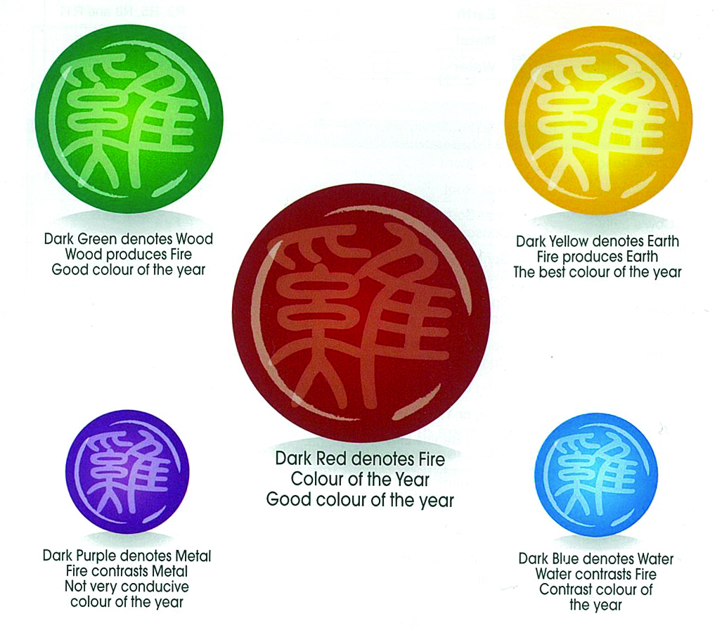
In today’s modern world, the symbol of Yin and Yang is easily distinguishable, in due part to its popular usage to denote a balance in life. This symbol, in Chinese cosmology, started from the Taiji along with the five basic elements (water, fire, earth, wood and metal).
The universe is considered to be neutral, hence the white (which signifies sunlight) and black (which signifies the earth) colours. When sunlight touches the earth, there will thus be a creation of life (an explosion of all colours).
Briefly, one must understand that each element and its colour is associated with specific parts of the body system, as can be seen in the table below.
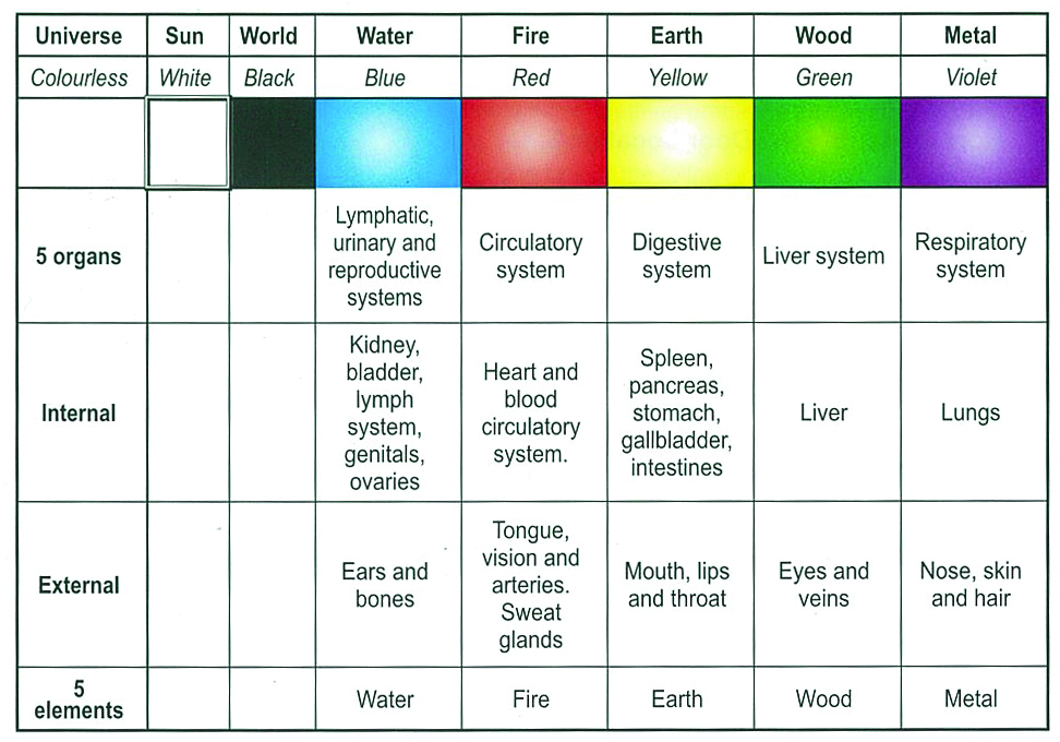
Interestingly, the colours can also be associated with the seasons. Spring is wood and the colour green; summer is fire and the colour red; autumn is metal and the colour white; winter is water and the colours black / blue; whereas the period between the seasons is earth and the colour yellow.
However, the colours are not so easily categorised just like that. They must be observed carefully in order to distinguish between good health and sickness.
Below are some of the examples:
1) A healthy red is not dull, it is a vibrant red enveloped by a vibrant white corona.
2) A healthy white is like a swan’s feathers and not that of salt.
3) A healthy green is like green turf or jade and does not have any tinct or hint of blue.
4) A healthy yellow is like sulphur and not that of yellow soil.
5) A healthy black is like glossy black paint and not that of dull charcoal.
As 2017 is the year of the Fire Rooster, therefore the auspicious colour for the year is dark yellow or brown, followed by dark red and dark green.
Colour is all around us, even if we do not always notice them. As the experts have given their views on the colours for 2017, ranging from vibrant hues to more muted tones, it is easy to get bewildered by the sheer variety. However, whatever the colour that is chosen for one’s home or lifestyle, make sure that it is a hue which is able to affect the mood in a positive manner.
The article is first published in StarProperty.my pullout on Dec 7. Download StarProperty.my e-Mag(bit.ly/StarProperty_Emag) to read more.