By Viktor Chong
Designing the interior of your home can be a daunting task, especially if you are not a professional. A multitude of questions come to mind when such an endeavour is undertaken, such as the colours for the respective rooms or the combination of colours that match. Fortunately, this guesswork can be minimised by consulting with a colour wheel, which is designed to make almost any colour you pick look good together.
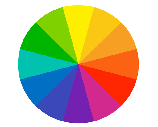
Before we begin, let's start with the colour basics:

Primary colours: Yellow, red and blue are the roots of every other colour, meaning that you can derive many different colours by mixing the three primary pigments.
Secondary colours: Green, orange and purple can be created by mixing two primary colours together. For example, orange is the combination of yellow and red, while green is created from yellow and blue.
Tertiary colours: Another six tertiary colours are created by mixing primary and secondary colours together.
Now how do we use the colour wheel?
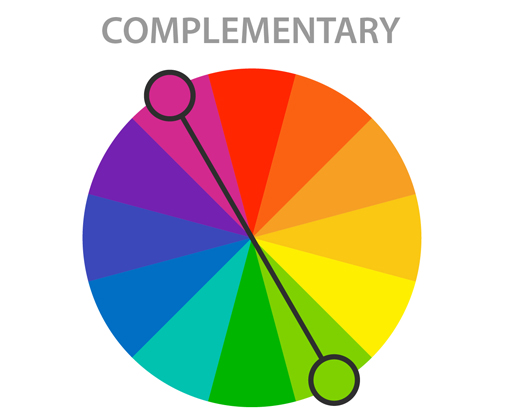
Starting with the complementary colour scheme, we choose the two colours on opposing sides of the colour wheel. In this illustration, magenta and lime green is chosen as an example. Since they create high contrast when paired together, complementary colours create a popping look to your room.
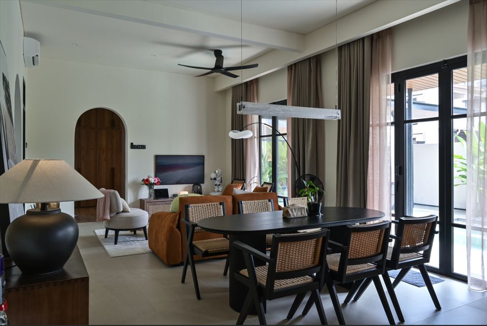
Complementary colours in vast quantities become loud and you may want to tone it down with neutral colours. However, if you intend to make something stand out, then go ahead with the powerful contrast. When colour schemes are considered, people may assume that this is confined to the paint on the walls. That is not true, as colour can also be derived from your curtains, rugs and furniture.
Going analogue
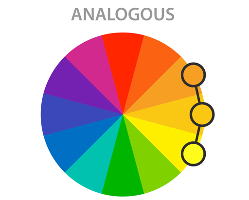
With the analogous colour scheme, we pick the three hues neighbouring each other on the colour wheel. Ideally, one should be a dominant colour, usually a primary or secondary colour, followed by a supporting colour which is made up of a secondary or tertiary colour. The third colour is either a mix of the first two colours or an accent colour.
Utilising the 60:30:10 rule, 60% of the space, which forms the largest portion of your room should ideally be treated with the base colour, such as the wall, area rug and furniture. The other 30% will be the accent colour, which is composed of the rug, bedding, window treatment and chairs. For the remaining 10%, use the dominant colour for your art, accessories and throw pillows.
With analogous colours, users are also encouraged to make mixtures inspired by nature. For example, a combination of orange, red and yellow is reminiscent of the rising sun, while blue and green mimic nature.
Need more fabulous ideas to improve and spruce up on your interior design? Visit Perfect Livin and check out the latest accessories and furnishing to make your dream home a reality.
Stay ahead of the crowd and enjoy fresh insights on real estate, property development, and lifestyle trends when you subscribe to our newsletter and follow us on social media.